Table of Contents
Data Visualization
Data visualization is the art and practice of gathering, analyzing, and graphically representing empirical information.
They are sometimes called information graphics, or even just charts and graphs.The goal of visualizing data is to tell the story in the data.Telling the story is predicated on understanding the data at a very deep level, and gathering insight from comparisons of data points in the numbers
As algebra is the abbreviated shorthand for arithmetic, so are charts a way to “abbreviate and facilitate the modes of conveying information from one person to another” – William Playfair
Why data visualization?
- Gain insight into an information space by mapping data onto graphical primitives
- Provide qualitative overview of large data sets
- Search for patterns, trends, structure, irregularities, relationships among data
- Help find interesting regions and suitable parameters for further quantitative analysis
- Provide a visual proof of computer representations derived
Categorization of visualization methods
- Pixel-oriented visualization techniques
- Geometric projection visualization techniques
- Icon-based visualization techniques
- Hierarchical visualization techniques
- Visualizing complex data and relations
Pixel-Oriented Visualization Techniques
- For a data set of m dimensions, create m windows on the screen, one for each dimension
- The m dimension values of a record are mapped to m pixels at the corresponding positions in the windows
- The colors of the pixels reflect the corresponding values
![]()
Laying Out Pixels in Circle Segments
To save space and show the connections among multiple dimensions, space filling is often done in a circle segment
![]()
Geometric Projection Visualization Techniques
Visualization of geometric transformations and projections of the data
- Methods
- Direct visualization
- Scatterplot and scatterplot matrices
- Landscapes
- Projection pursuit technique: Help users find meaningful projections of multidimensional data
- Prosection views
- Hyperslice
- Parallel coordinates
Scatter Plots
- A scatter plot displays 2-D data points using Cartesian coordinates.
- A third dimension can be added using different colors or shapes to represent different data points
- Through this visualization, in the adjacent figure, we can see that points of types “+” and “×” tend to be colocated
Scatterplot Matrices
- The scatter-plot matrix is an extension to the scatter plot.
- For k-dimensional data a minimum of (k2-k)/2 scatterplots of 2D will be required.
- There can be maximum of k2 plots of 2D
- In the adjoining figure , there are k2 plots. Out of these, k are X-X plots, and all X-Y plots (where X, Y are distinct dimensions) are given in 2 orientations (X vs Y and Y vs, X)
Parallel Coordinates
- The scatter-plot matrix becomes less effective as the dimensionality increases. Another technique, called parallel coordinates, can handle higher dimensionality
- n equidistant axes which are parallel to one of the screen axes and correspond to the attributes (i.e. n dimensions)
- The axes are scaled to the [minimum, maximum]: range of the corresponding attribute
- Every data item corresponds to a polygonal line which intersects each of the axes at the point which corresponds to the value for the attribute
Icon-Based Visualization Techniques
Visualization of the data values as features of icons
- Typical visualization methods
- Chernoff Faces
- Stick Figures
- General techniques
- Shape coding: Use shape to represent certain information encoding
- Color icons: Use color icons to encode more information
- Tile bars: Use small icons to represent the relevant feature vectors in document retrieval
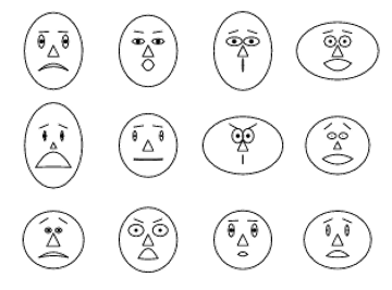
Chernoff Faces
- A way to display variables on a two-dimensional surface, e.g., let x be eyebrow slant, y be eye size, z be nose length, etc.
- The figure shows faces produced using 10 characteristics–head eccentricity, eye size, eye spacing, eye eccentricity, pupil size, eyebrow slant, nose size, mouth shape, mouth size, and mouth opening): Each assigned one of 10 possible values.
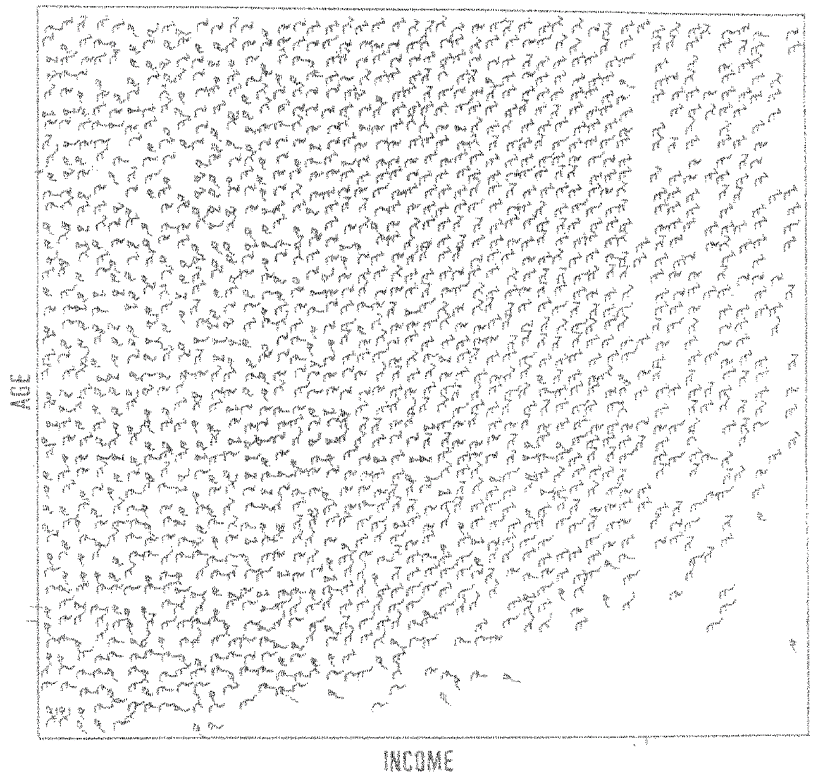
Stick Figure
- A census data figure showing age, income, gender, education
- A 5-piece stick figure (1 body and 4 limbs w. different angle/length)
- Age, income are indicated by position of the figure.
- Gender, education are indicated by angle/length.
Visualization can show a texture pattern
Hierarchical Visualization
For a large data set of high dimensionality, it would be difficult to visualize all dimensions at the same time.
Hierarchical visualization techniques partition all dimensions into subsets (i.e., subspaces). The subspaces are visualized in a hierarchical manner
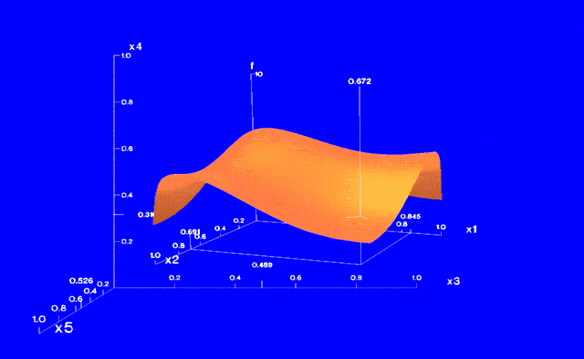
“Worlds-within-Worlds,” also known as n-Vision, is a representative hierarchical visualization method.
To visualize a 6-D data set, where the dimensions are F,X1,X2,X3,X4,X5. We want to observe how F changes w.r.t. other dimensions.
We can fix X3,X4,X5 dimensions to selected values and visualize changes to F w.r.t. X1, X2
Visualizing Complex Data and Relations
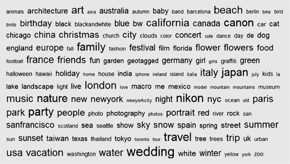
Most visualization techniques were mainly for numeric data. Recently, more and more non-numeric data, such as text and social networks, have become available.
Many people on the Web tag various objects such as pictures, blog entries, and product reviews.
A tag cloud is a visualization of statistics of user-generated tags. Often, in a tag cloud, tags are listed alphabetically or in a user-preferred order.
The importance of a tag is indicated by font size or color.